
BEWEAR
A streetwear brand's own store with a checkout that stopped losing sales at the last step.
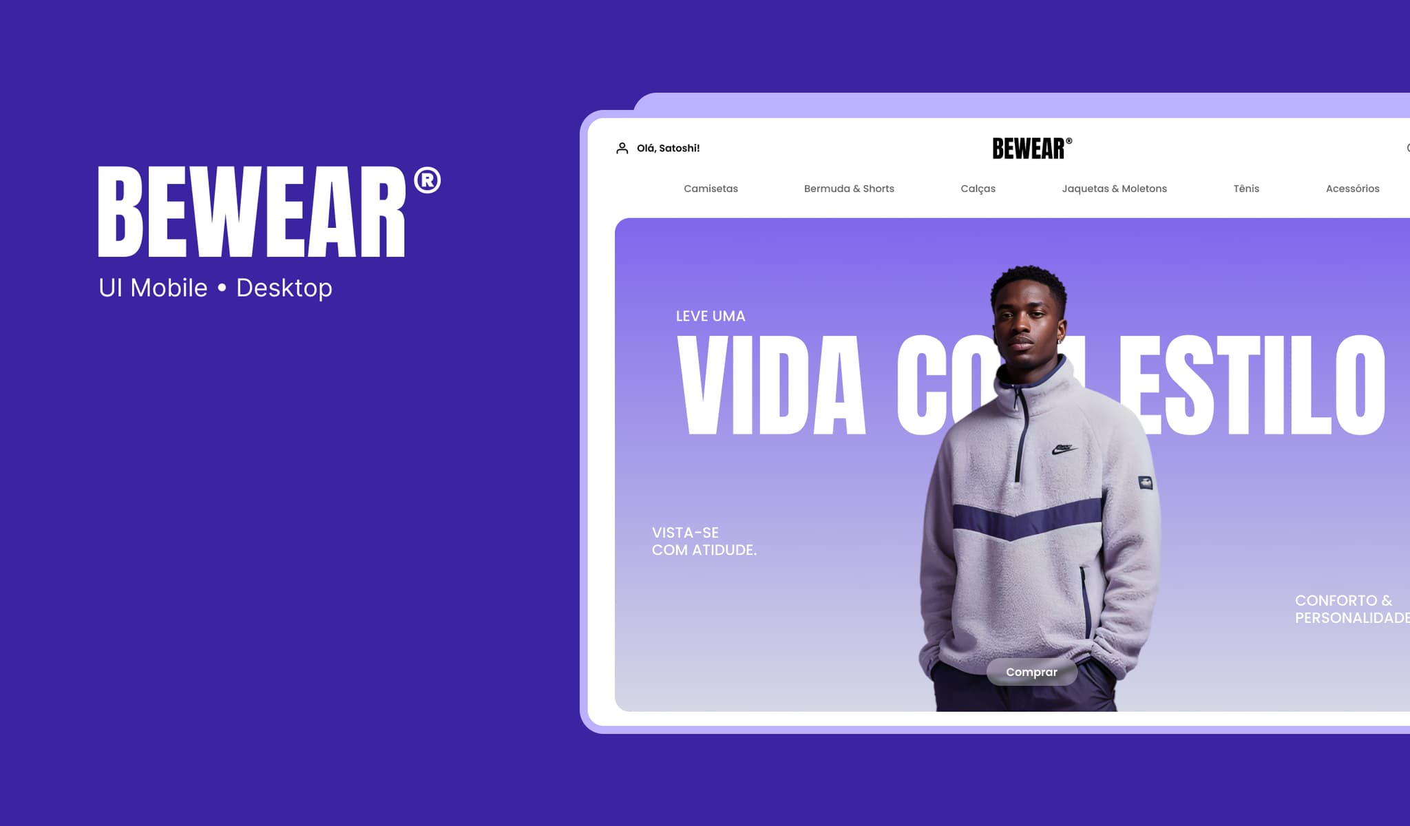
Context
BEWEAR started as a streetwear brand and needed to move from marketplaces to its own store — with a strong identity and a purchase journey that matched the brand's premium positioning.
Goals
- Reduce cart abandonment at checkout
- Create a reusable design system for web and mobile
- Increase purchase completion rate without friction
The problem
Research
I analyzed the funnel in analytics, benchmarked leading fashion e-commerces, and ran moderated usability tests with 8 real customers buying a product start to finish.
Discoveries
- ↳The identification step scared off users who just wanted to buy fast
- ↳Shipping and delivery time appeared too late in the journey
- ↳The cart didn't give confidence that the purchase was secure
Process
Discovery
Mapping the funnel and checkout pain points.
Flows
Redesign of the purchase and identification flow.
UI + DS
Interface and design system for web and mobile.
Testing
Validation with users and fine-tuning.
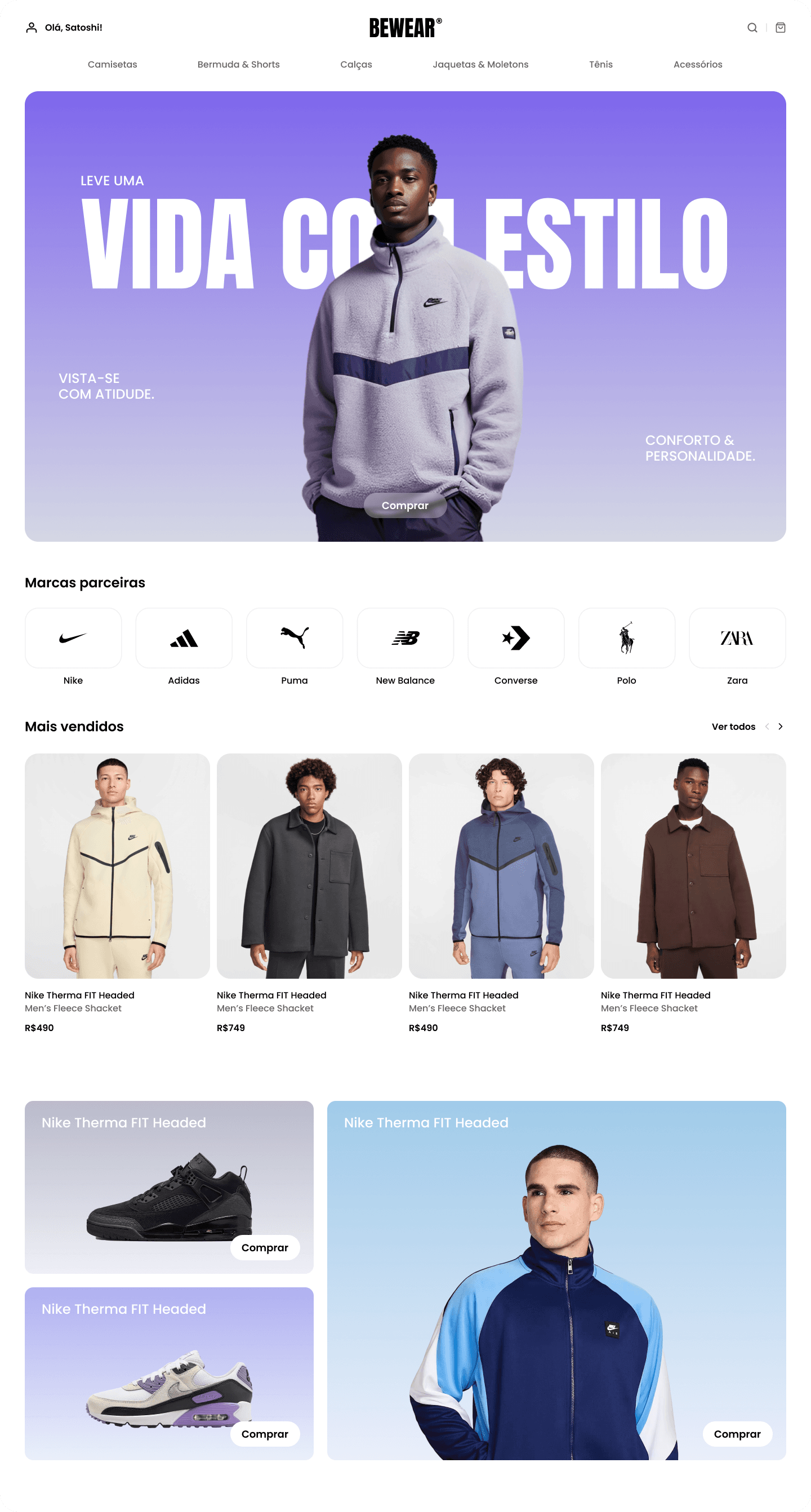
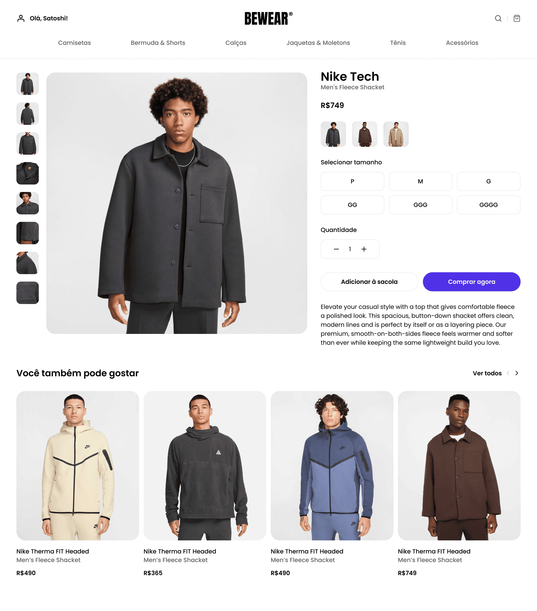
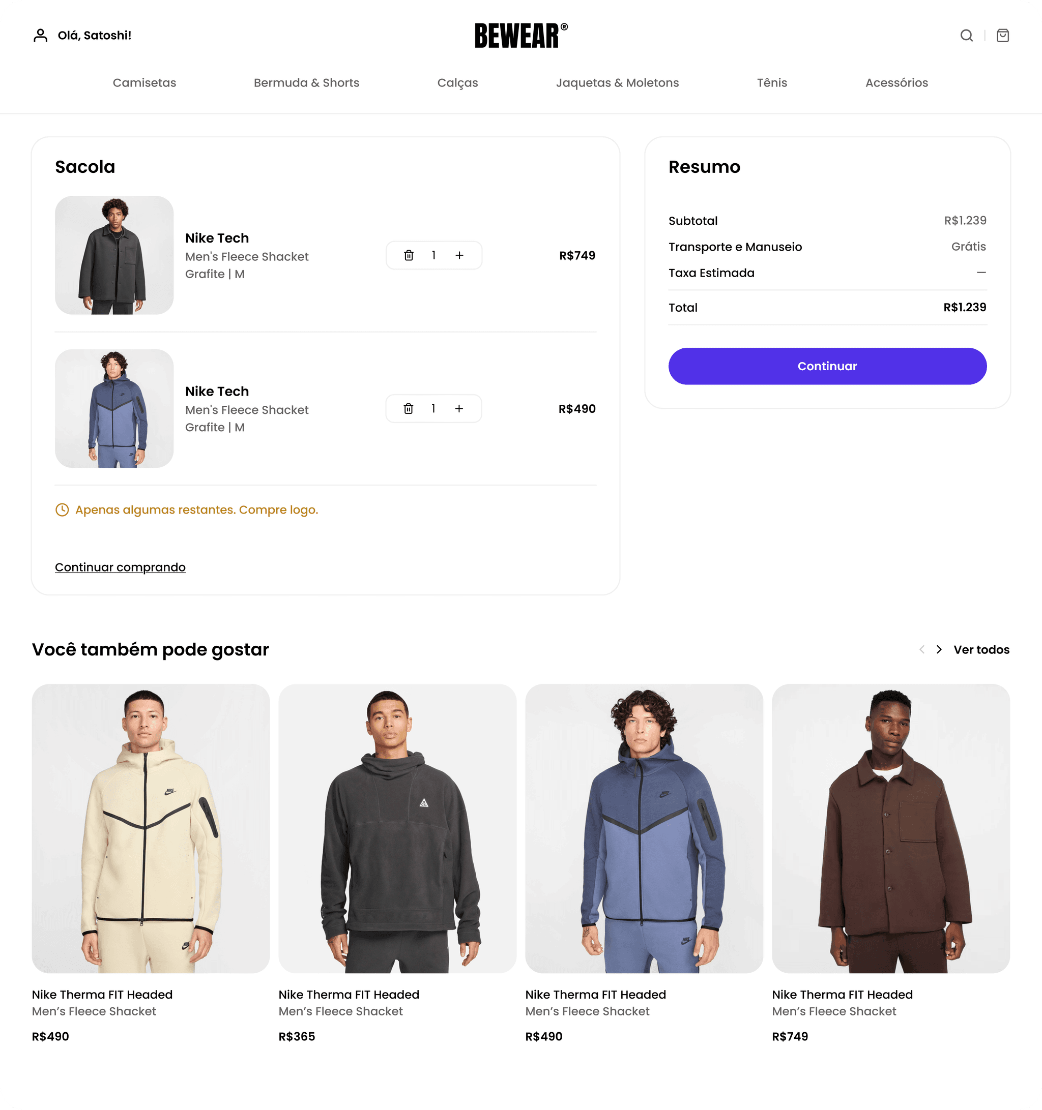
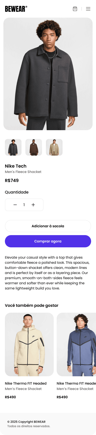
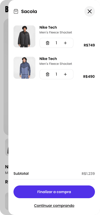
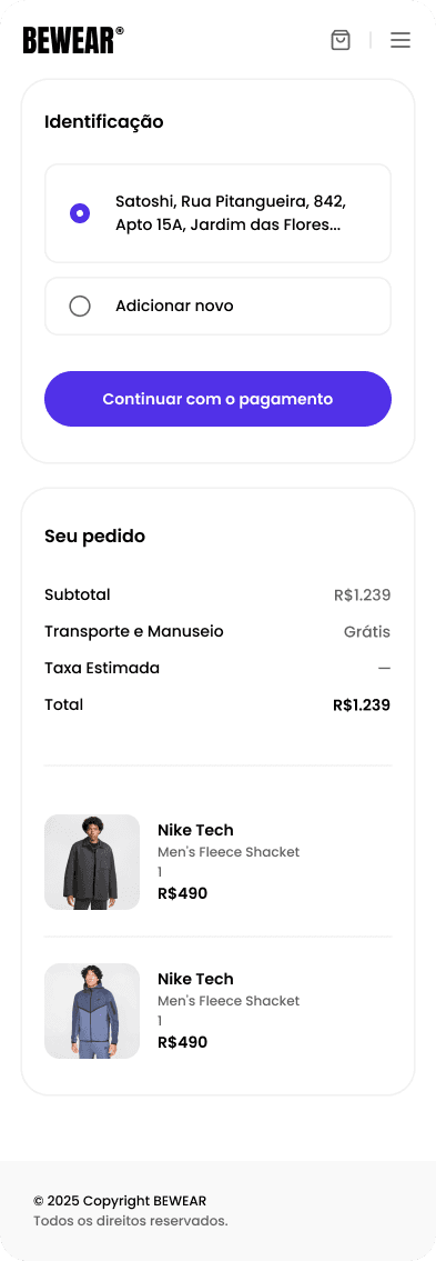
Solution · Final interface
A lean checkout, with optional identification and an order summary always visible.

Results & impact
By shortening checkout and moving shipping and summary to the start of the journey, friction at the last step dropped drastically — and the design system now speeds up every new screen for the brand.
Learnings
In e-commerce, every step removed from checkout is worth more than any pretty screen. Trust and clarity convert.